Build a Responsive Product Card Gallery with Plain HTML & CSS
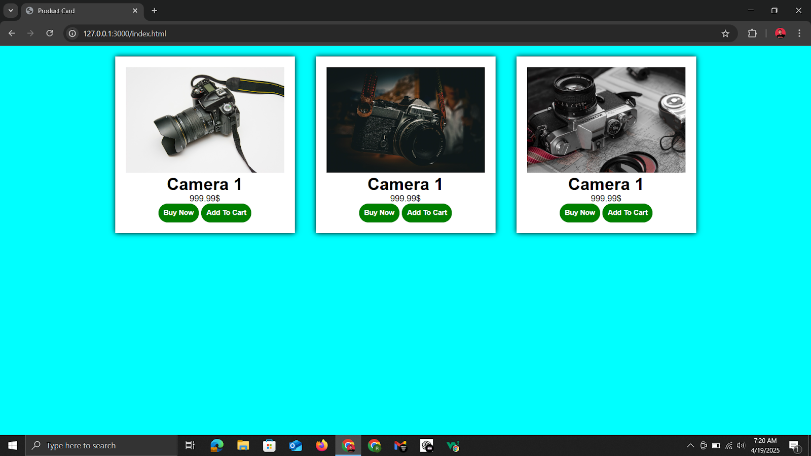
What’s up, SmartTechTip fam? If you’ve ever wanted to showcase your products in a sleek, responsive grid—complete with hover effects and clean buttons—today’s tutorial is for you. We’ll take your basic HTML and CSS (no frameworks!) and turn it into an eye‑catching product card gallery that adapts to any screen. Ready? Let’s dive in!
For souce code and images click on this Github Link.
1. HTML Structure
First, let’s lay out the markup. We’ll wrap all of our cards in a <div class="container"> and give each product its own <div class="card">:
<!DOCTYPE html>
<html lang="en">
<head>
    <meta charset="UTF-8">
    <meta name="viewport" content="width=device-width, initial-scale=1.0">
    <title>Product Card</title>
    <link rel="stylesheet" href="style.css">
</head>
<body>
    <div class="container">
        <div class="card">
            <img src="images/product-1.jpg" alt="">
            <h1>Camera 1</h1>
            <p>999.99$</p>
            <button>Buy Now</button>
            <button>Add To Cart</button>
        </div>
        <div class="card">
            <img src="images/product-2.jpg" alt="">
            <h1>Camera 1</h1>
            <p>999.99$</p>
            <button>Buy Now</button>
            <button>Add To Cart</button>
        </div>
        <div class="card">
            <img src="images/product-3.jpg" alt="">
            <h1>Camera 1</h1>
            <p>999.99$</p>
            <button>Buy Now</button>
            <button>Add To Cart</button>
        </div>
    </div>
</body>
</html>
That’s all you need on the HTML side—three products in a flex container. Next up, let’s style it.
2. CSS Styling
Paste this into your style.css without any modifications. It will:
- Reset margins, padding, and set a global font
- Center the container with Flexbox
- Add shadows, spacing, and a subtle hover‑scale effect to each card
- Style buttons with rounded corners and a hover state
*{
    margin: 0;
    padding: 0;
    box-sizing: border-box;
    font-family: Arial, Helvetica, sans-serif;
}
body{
    background-color: aqua;
}
.container{
    display: flex;
    justify-content: center;
    align-items: center;
}

.card{
    text-align: center;
    box-shadow: 0 0 10px;
    margin: 20px;
    padding: 20px;
    background-color: white;
    transition: transform 0.3s;
}
.card img{
    width: 300px;
}
.card:hover{
    transform: scale(1.1);
}
button{
    padding: 10px;
    border-radius: 20px;
    border: none;
    background-color: green;
    color: white;
    font-weight: bold;
}
3. How It Works
- Global Reset: Zeroes out default margins/padding and applies a clean font.
- Flex Container: Centers your cards both horizontally and vertically.
- Card Styling: Shadows + padding + white background give a neat, floating look.
- Hover Effect:
transform: scale(1.1)makes each card pop on hover. - Button Design: Rounded pills with bold text—and you can tweak the color as you like.
4. Next Steps
Once you’ve got this base working, consider:
- Making the grid responsive with media queries or CSS Grid.
- Lazy‑loading your images using
loading="lazy". - Adding ARIA labels for better accessibility.
- Integrating real data via JavaScript or a front‑end framework.
Wrapping Up
And there you have it—a no‑fluff, pure HTML/CSS product card gallery that you can drop into any project. If you found this helpful, let me know in the comments below or share your own spin using #SmartTechTip. Happy coding!