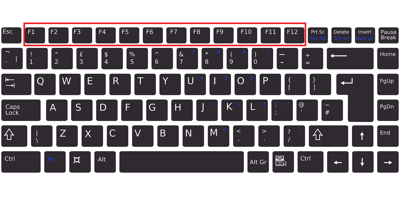
On your Computer Keyboard or Laptop keyboard, you always see F1 to F12 Function Keys, right. But, have you ever wondered what are these keys(F1 to F12) and their uses are? What are Function Keys? Function Keys are the keys that are on the top of the keyboard from F1 to F12 for performing different functions that make the use of the computer ease. Like for example, Function Key can be used to Refresh/Reload webpage or computer, saving the file, closing the window, etc. To Use Function Key On Laptop, you should press function keys with the 'fn' key which is on the bottom of your keyboard. What are the Uses of F1 To F12 Function Key? F1 Key: The F1 key is used to open the Help Center of the Application. For example, if you press the F1 key while using Chrome Browser, Google Chrome Help Center will open. F2 Key: The F2 key is used to Rename the file or folder on the computer quickly. Usually, to rename a file/folder, you right-click on it and click on rename to change its name, rig...
If you use a Samsung smartphone then you must know these 10 Hidden Features. These 10 features can make your smartphone uses more efficient and interesting. Turn Off Notification of The App Quickly and Permanently On our smartphones, we daily get different types of notifications from different apps. Some App Notification can become so much annoying when the Notification is popping up many times. If you want to quickly disable Notification of the particular app or make Notification Silent then you can long-press on the Notification and disable it or select the silent or alert option. Camera Flash Notification You can also make your smartphone camera flash when the notifications pop up on your smartphone. To Enable Camera Flash Notification you have to Follow These Steps: Open Smartphone Settings. Go To Accessibility Option. Go To Advanced Settings Then, Go To Flash Notification and Enable it. Or Simply Search "Flash Notification" on Smartphone Settings Search Bar. Swipe Do...
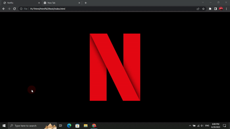
In this blog post, we will explore how to create a simple yet captivating animation inspired by the Netflix logo using HTML and CSS. By following the provided code snippets and step-by-step instructions, you'll be able to replicate the animation and gain insights into the key concepts involved. So, let's dive in and bring some Netflix vibes to your web project! HTML Structure: To get started, create a new HTML file and paste the following code inside the `<body>` tags: <!DOCTYPE html> <html lang="en"> <head> <meta charset="UTF-8"> <meta name="viewport" content="width=device-width, initial-scale=1.0"> <title>Netflix</title> <link rel="stylesheet" href="style.css"> </head> <body> <div class="container"> <div class="netflix"></div> ...
Apple is one of the most valuable tech companies in the world. Below I have mentioned 15 awesome facts about Apple company. Apple First Logo The first Apple logo was not the same as what you see today. It was like the image below where you can see Issac Newton near Apple Tree. It was drawn by Ronald Wayne. Later, Apple Logo became simpler. Apple Made The First Digital Colored Camera In 1997, Apple made the first consumer digital camera. Its name was Apple QuickTake. First Apple iPhone was revealed On Jan 9, 2007 The first-ever Apple iPhone was revealed On Jan 9, 2007, by Steve Jobs. While revealing the first new Apple iPhone, Steve Jobs called it a true Revolutionary product. Later on June 29, 2007, it was available to be purchased by the consumers. Apple First Product Was A Computer Called Apple Computer 1 Many people think Apple is a company that makes iPhones. But, Apple's first product wasn't an iPhone. It was a computer called Apple Computer I. Apple Macbook Batteries ...
In today's digital landscape, keeping your website updated with strategic features is crucial for gaining a competitive advantage. These updates not only enhance operational efficiencies but also improve how you engage with your customers. By embracing these enhancements, your small business can maintain relevance and achieve sustainable growth in a digital-first world. Subscription-Based Business Models Imagine converting your passion into a profitable subscription service. Whether you're providing exclusive digital content, regular product deliveries, or both, a subscription-based business model can create a steady revenue stream. This model not only ensures predictable income but also builds a loyal customer base that values what you offer. Leveraging Education for Enhanced Web Capabilities Diving into web-based projects with a solid educational foundation can significantly amplify your success. Earning a degree in a relevant field provides a deep u...
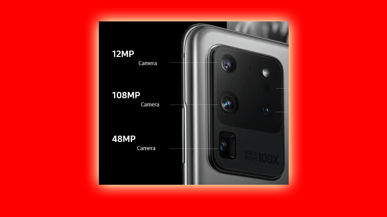
Right now, In a smartphone, you will get a 48MP Camera, 64MP Camera, 108MP Camera, and so on. But, Does this number of megapixels improve the image quality? What is a Megapixel? Megapixel means a million pixels in an image. Pixel is the small dot or square on the image. By combining millions of pixels, one image is formed. 1 Megapixel = 1 Million Pixel, 2 Megapixel = 2 Million Pixel, 12 Megapixel = 12 Million Pixel, 48 Megapixel = 48 Million Pixel, 64 Megapixel = 64 Million Pixel, and so on. Does More Megapixel equal better image quality? No. A Megapixel is just a million pixels in an image. Many other factors also matter while capturing an image like Image Sensor, Aperture, Megapixel, Lens, and Software. If you have a 108 Megapixel Camera with a small image sensor and a 12 Megapixel camera with a big image sensor. Then, The second one will have better quality. It's because, in a big image sensor, the pixel size is bigger. If the pixel size is bigger, it can capture...
QR Codes are everywhere — websites, apps, menus, payments, and more. In this tutorial, you will learn how to create a simple and powerful QR Code Generator using HTML, CSS, and JavaScript. This is a perfect beginner-friendly project and a great addition to your portfolio. We are also using a lightweight library called qrcodejs : CDN: https://cdn.jsdelivr.net/gh/davidshimjs/qrcodejs@master/qrcode.min.js ✅ Features Generate QR codes instantly Accepts text or URL Press Enter to generate Download QR code as PNG Modern UI with smooth design 📌 Full Source Code (HTML, CSS & JavaScript) 📄 HTML Code <!DOCTYPE html> <html lang="en"> <head> <meta charset="UTF-8"> <meta name="viewport" content="width=device-width, initial-scale=1.0"> <link rel="stylesheet" href="style.css"> <title>QR Code Generator</title> </head> ...
Dark mode is one of the most popular features in modern websites and apps. In this tutorial, you will learn how to build a simple Light & Dark Theme Toggle using just HTML, CSS, and JavaScript. This small project is perfect for beginners and helps you understand DOM manipulation and event handling. ⭐ GitHub Source Code You can download or view the full project on GitHub: 🔗 View on GitHub 🌗 What We Are Building This project contains a rounded switch. When you click the button: The background switches from light to dark The button slides smoothly The icon changes between ☀️ and 🌙 🧱 1. HTML Code <!DOCTYPE html> <html lang="en"> <head> <meta charset="UTF-8"> <meta name="viewport" content="width=device-width, initial-scale=1.0"> <title>Light and Dark Theme</title> <link rel="stylesheet" href="style.css"> </hea...
Learning to code and create computer programs is really cool and also the most important and demanded skill in today's modern world. These learning resources are easily available. Anyone can learn any skill, they want to learn easily. And In that learning process, YouTube helps a lot because YouTube contains millions of videos uploaded by people around the world that can teach us various skills and knowledge. Many people also try to learn coding from YouTube, but, did they succeed? Can We Learn Coding From YouTube? Yes, no doubt you can learn and become an expert at coding by just learning from YouTube and practicing yourself on your computer. Because there are already millions of tutorials/courses on various coding languages, various project videos, and various coding queries on YouTube for free that can help you sharpen your coding knowledge. And if you are a beginner and just started learning to code, you will get your many answers from YouTube alone by just searchin...
Building small projects is one of the best ways to improve your web development skills. In this tutorial, we will create a modern gradient calculator using HTML, CSS, and JavaScript. This project will help you understand layout design, CSS styling techniques like glassmorphism, and JavaScript event handling. By the end of this guide, you will have a fully working calculator with a clean UI and smooth interactions. GitHub: You can find the complete source code here . Project Overview This calculator includes: A modern gradient background A glass-style calculator interface Buttons for numbers and operators Clear and delete functionality A working equals calculation We will build this project using three parts: HTML for the structure CSS for the design and layout JavaScript for the calculator logic Step 1: HTML Structure First, we create the layout of the calculator. This includes the display screen and all the buttons. <!DOCTYPE html> <html ...


